
Promoting Black-Owned Businesses in Chicago
My Block, My Hood, My City
During my sophomore year of college, I worked with My Block, My Hood, My City (M3) on a project for Design for America. M3 is one of Chicago’s most active nonprofits and works to provide opportunities to volunteer, participate, and get engaged. They specialize in providing underprivileged youth with an awareness of the world and opportunities beyond their neighborhood.
See our one-pager here.
Timeline: Jan-June 2021
Scope: UX Design, UX Research, Visual Design
Role: Design Team Lead
Team Members: Alex C, Rawan M, Orly S, Kareena S
Overview
-
Currently, M3 serves as the middleman between black-owned businesses and large corporations who seek to support and engage with these business owners. They came to us with a desire to spread more awareness of these businesses in the Chicago area.
-
How can we promote Black-owned businesses in Chicago while fostering a sense of community between business owners and consumers?
-
An app directory of Black-owned businesses such as restaurants, barbershops, retail, and more, with functionalities to engage with the businesses in a variety of ways
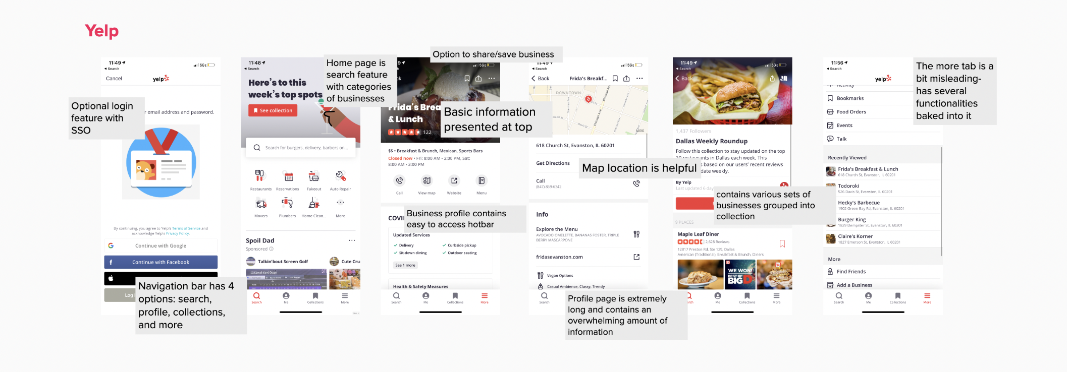
Competitive Analysis
Going into this project, we were aware that several business directory apps already existed. The two we decided to further explore were Yelp and Open Table. Through our analysis, we identified features and design elements of these apps that were beneficial to the users or a source of frustration. Our main takeaways were:
Both apps offered an optional log-in feature. Users could take advantage of the core functionalities of the app without having to log-in, but creating a profile offered additional features such as leaving a review.
Yelp’s hotbar offers an efficient way for users to connect with businesses.
Depending on the tab of the app, businesses are presented either as thumbnails, lists, or full profiles.
Both apps offered the option to save businesses for future reference

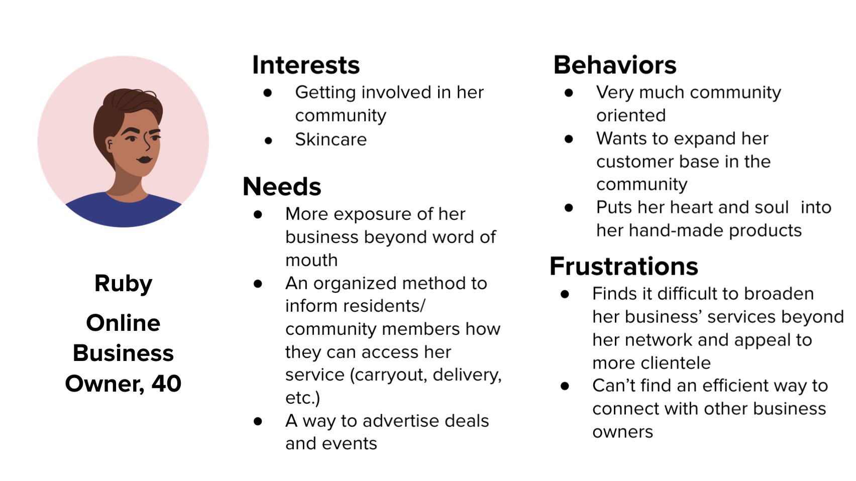
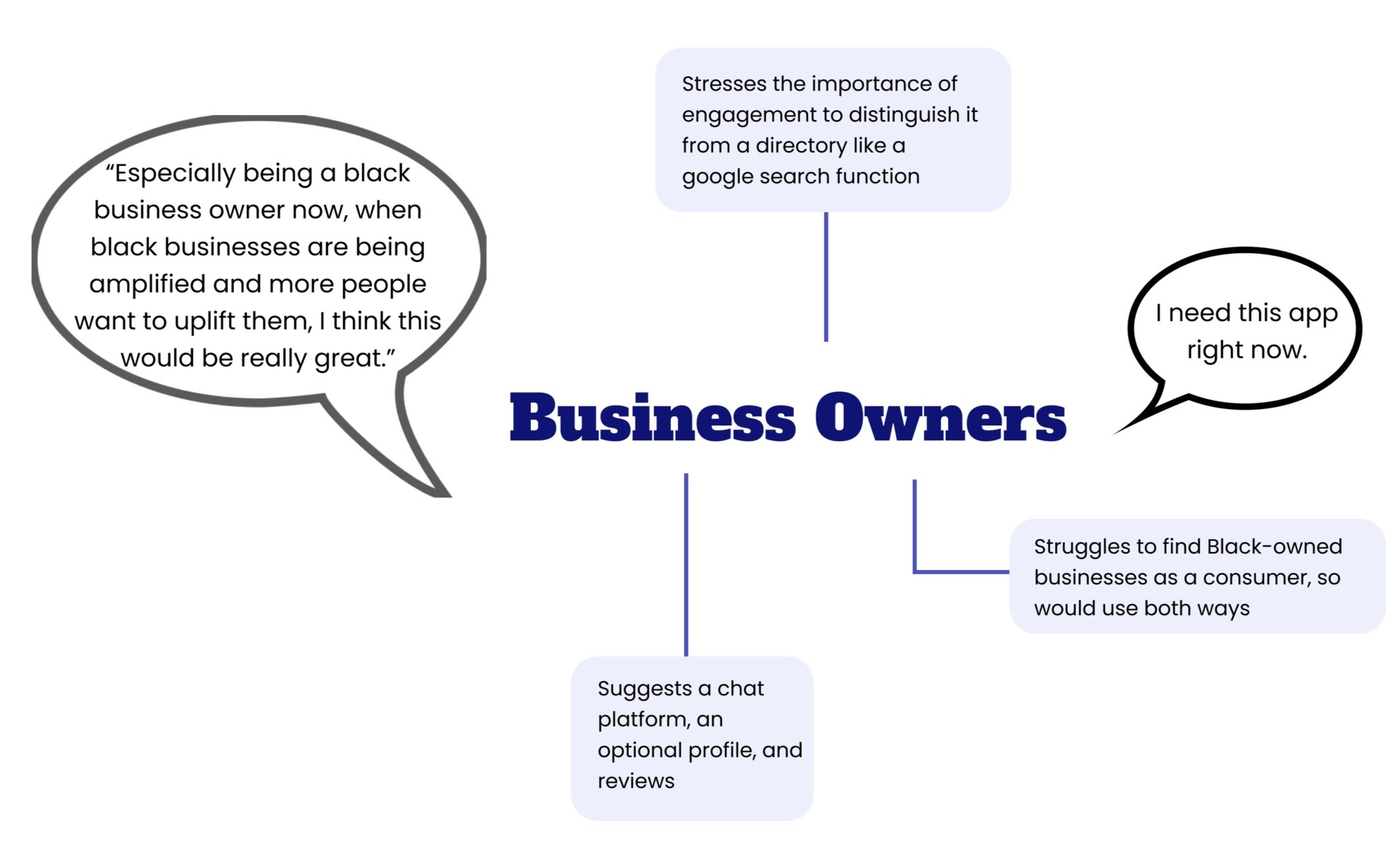
User Personas
Form our how can we, we developed two possible types of users for our app: the business owner and the Chicago consumer. These helped us understand our users’ needs, frustrations, behaviors, and goals.

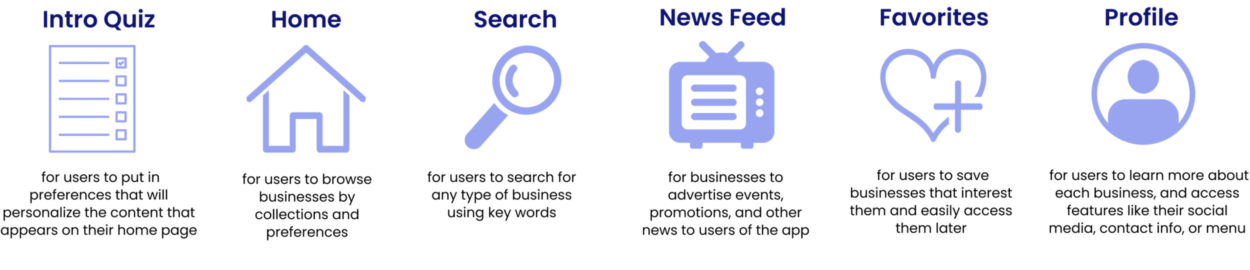
Ideation
With our competitive analysis and user personas in mind, we brainstormed some initial ideas for our app. In particular, we came up with six key features.
Once we developed the initial features of the app, we were able to highlight the possible pain points each of the users would have with our hypothetical app using a journey map:
Journey Map


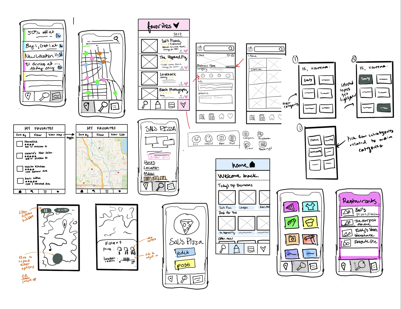
Low-Fidelity Wireframes
With initial ideation in mind, our team created a few sets of wireframes containing the 6 basic features we ideated above. To gain inspiration for these features, we looked at various apps we used everyday, such as ESPN. Zillow, and Pinterest.
Mid-Fidelity Wireframes
After designing low-fidelity wireframes, our team presented their ideas to each other. We converged to design some mid-fidelity wireframes with a more cohesive look and feel.


Concept Testing
With these mid-fidelity wireframes, we decided to gain some user feedback on the features of our app. We were able to interview two Black-owned business owners and ten Chicago consumers. During these interviews, we did two things:
Walked through the wireframes and the intended capabilities of the app.
Asked users what suggestions they had or possible frustrations they could imagine with the current design.
Because we did not have an interactive prototype yet, this was not a usability test but rather an opportunity for us to check our concept with users and ensure we were designing something that solved their needs.
-
Both business owners expressed an immediate desire to download our app, which validated the need for our design
Many users suggested having an optional log-in feature through SSO. The main reason for this was to have the ability to leave reviews for businesses, which was particularly important for consumers trying to find which businesses to support.
In general, many consumers felt that the app was no different from a very specific version of Yelp. They weren’t compelled to use it and wondered what distinguished us from just a google search function.
In general, various users had suggestions for additional features to add, such as incorporating social media, donations, notifications, and business spotlights.

Pivoting
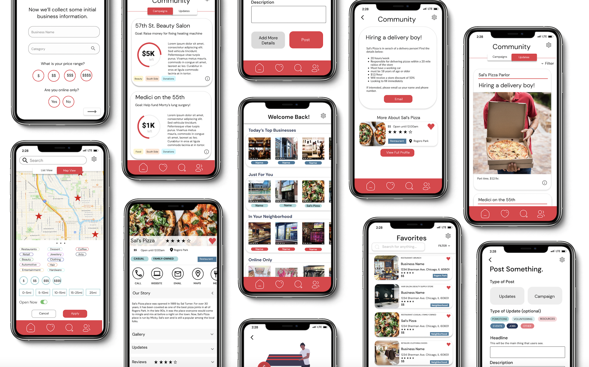
The feedback we received from our user interviews made us realize that we needed to focus more on the community aspect of our app, as this is what distinguished us from any other business directory like Yelp. In order to do this, we made three changes to our app design:
Transform the “Updates” tab to a “Community” tab, allowing businesses to interact with consumers in more ways such as donation campaigns, job postings, and anything else
Design the profile to be more personal, focusing on the story of the business and business owner
Allow users to share businesses or donation campaigns via social media.


Style Guide
Before beginning high-fi prototypes, we established a Style Guide that includes the typography, icons, brand colors, and structure of the app. Because this app is meant to be based in Chicago, we decided to the use the city and the flag as our inspiration.

High-Fi Prototype
Below is a snapshot of some wireframes of the final product that we handed off to My Block, My Hood, My City. Feel free to explore the Figma prototype!
Reflection
What I Would Have Done Differently
This project was completed while I was a full time student at Northwestern. As a result, there were often situations when I wanted to contribute more to the project but didn’t have the time. With more time, there were several things I would have done differently:
-
We began creating app wireframes before talking to any actual users of the app. Although we created two personas, we didn’t have any research backing up those personas. I realized it’s important that the needs and desires of our personas are based on real research, rather than assumptions.
-
In the interviews we conducted, we received an overwhelming amount of suggestions for possible features to add to our app. Some we were able to include, such as donation campaigns, but there were others like business spotlights and in-app purchases that we simply did not have the time to work with.
-
By the time we finished creating the high-fi prototype, we ran out of time to test the app with any users. A better approach may have been to start with a mid-fi interactive prototype for testing, and then transition to something more high-fi.
Key Takeaways
My experience as a design lead on this project was equally stressful, exciting, and impactful. Over the six months, I very quickly began to understand the role of teaming in design as I navigated team dynamics, diverse work styles, and impending deadlines. I learned the importance of communication, both within my own team, our project sponsor at My Block, My Hood, My City, and the larger Design For America network. Furthermore, I discovered the importance of relying on your research, especially what you hear from users, in guiding the trajectory of your design. All-in-all, this project let me understand the importance of each step in the human-centered design process, and taught me that sometimes pivots are necessary to develop the best solution. Ultimately, I am grateful to Design for America for giving me the opportunity to spearhead such an impactful project.